When we talk about conversion-focused website design, we're not just talking about making things look good. We're talking about a strategic practice of building a website with one primary goal: to guide visitors toward a specific, measurable action. That could be making a purchase, filling out a form, or picking up the phone.
This approach puts user psychology and data analysis front and center, moving beyond purely aesthetic choices. Every single element—from the headline to the button color—has a job to do. It’s about turning your website traffic into real, tangible business results.
Building Your Strategic Design Foundation

Before a single pixel gets placed or a line of code is written, the most successful websites are built on a bedrock of clear strategy. A beautiful design that doesn't convert is just an expensive digital brochure. True conversion-focused design starts by asking one simple, critical question: "What do we want the user to do?"
This immediately shifts the conversation away from subjective preferences ("I like the color blue") and into the world of objective business outcomes. Every decision, from layout to language, has to be justifiable and tied back to a specific goal. Without this foundation, you'll end up with a disjointed experience that confuses users and costs you revenue.
Defining Your Core Conversion Goals
First things first: you have to define what a "conversion" actually means for your business. It's rarely just one thing. For a luxury e-commerce brand, the main goal is an online purchase, but secondary goals like email sign-ups or account creations are also incredibly valuable. A B2B service firm, on the other hand, is probably focused on demo requests or whitepaper downloads.
Your goals need to be specific and measurable. Vague objectives like "increase sales" just aren't actionable. Get precise.
- For a luxury real estate agency: Increase qualified tour bookings by 40%.
- For a SaaS company: Boost demo requests from enterprise clients by 25%.
- For a direct-to-consumer brand: Achieve a 15% uplift in email newsletter sign-ups.
These specific Key Performance Indicators (KPIs) become your North Star. They'll guide every single design and development choice you make from here on out.
Mapping the Ideal Customer Journey
Once you know your destination (the conversion), you need to map out the path to get there. The customer journey outlines every single step a user takes, from their first interaction with your brand to that final, desired action. This is really a blueprint for empathy, forcing you to see your website through your visitors' eyes.
A typical journey map for a service brand might look something like this:
- A potential client finds one of your blog posts through a Google search.
- They click through to a related case study, which starts to build trust.
- Impressed, they navigate to your services page to see exactly what you offer.
- Finally, they hit the "Request a Consultation" CTA and fill out the form.
Understanding this flow helps you spot potential points of friction before they become a problem. Where might a user get lost? What information do they need at each stage? Building a truly user-centric website means anticipating these needs and creating a seamless path forward. You can read more about this in our guide on building a user-centric website.
Key Takeaway: A conversion-focused website doesn't leave the user's path to chance. It deliberately architects a journey that feels intuitive and guides them effortlessly toward your most important business goals.
Conducting a Sharp Competitive Analysis
Finally, take a hard look at what your competitors—both direct and indirect—are doing. The goal here isn't to copy them; it's to identify patterns, strengths, and, most importantly, weaknesses. Analyze their websites with a critical eye.
Ask yourself these questions:
- What's their primary call-to-action? Is it clear and compelling, or is it buried?
- How do they build trust? Look for testimonials, case studies, or security badges.
- What's their core value proposition, and how quickly do they communicate it?
- Is their mobile experience just as strong as their desktop version?
This kind of analysis reveals gaps in the market and huge opportunities for you to differentiate yourself. Maybe their checkout process is a nightmare, or their key selling point is hidden three clicks deep. These are openings for you to win.
To really get ahead, you have to learn how to increase website conversion rate by mastering these fundamentals and optimizing every click. This strategic groundwork ensures your design is not only beautiful but also a powerful engine for business growth.
Designing for Intuitive Navigation and Flow
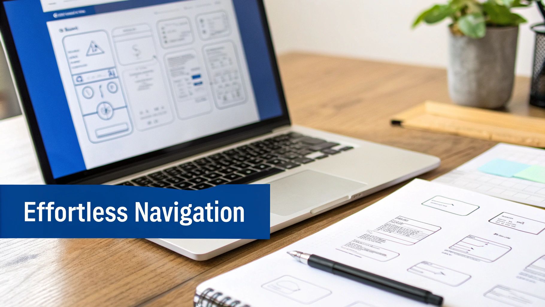
If a visitor has to stop and think about where to click next, you're about to lose them. It's that simple. The ultimate sign of respect for a user's time is a seamless, intuitive experience. This has nothing to do with flashy animations and everything to do with crafting a digital space so logical that the path to conversion feels like the most natural next step.
Your website’s structure—its information architecture—is the skeleton holding the entire user experience (UX) together. When you get it right, people don't even notice it. They just find what they need, their trust in your brand grows with every click, and they move effortlessly from discovery to action. For a luxury brand, this effortless flow is an extension of the premium experience customers expect in your store.
Architecting a Frictionless User Journey
Think of your website's navigation like the signage in a high-end boutique: clear, minimal, and designed to guide people gracefully toward the main attractions without causing confusion. The goal is to reduce cognitive load—the mental effort required to use your site. A confused mind almost never buys.
To get there, every single element needs a clear purpose and position. The most effective navigation systems are built on established expectations. For instance, 94% of users expect to see the company logo in the top-left corner, and they expect it to link back to the homepage. Straying from these simple conventions just creates unnecessary friction.
Picture a B2B service provider. A potential client lands on their site searching for proof of expertise. The navigation should make "Case Studies" or "Our Work" instantly obvious, not buried under a vague, corporate-speak term like "Solutions."
Pro Tip: Keep your main navigation menu to a maximum of seven items. This is based on "Miller's Law," which suggests the average person can only hold about seven things in their short-term memory. Limiting choices prevents analysis paralysis and keeps the user focused.
The Power of Visual Hierarchy and Scannability
Let's be honest: people don't read websites; they scan them. A strong visual hierarchy guides the user's eye to the most important elements on the page, in a very specific order. You achieve this through the strategic use of size, color, contrast, and my personal favorite, white space.
Your main headline should always be the largest text on the page. Subheadings come next, followed by the body text. Your primary call-to-action (CTA) button needs to use a contrasting color that makes it "pop" off the page, drawing the eye and practically begging to be clicked.
To create content that’s easy to scan:
- Use short paragraphs. Break up intimidating walls of text into digestible, 1-3 sentence chunks.
- Lean on bullet points. They're perfect for listing features, benefits, or key takeaways in a format that's easy to skim.
- Bold key phrases. Emphasize the most critical information to grab attention as users scroll.
This kind of structure allows a visitor to understand your value proposition in seconds, making them far more likely to stick around.
Wireframing and Mapping User Flows
Before you even think about colors or fonts, you have to map the journey. A wireframe is a simple, low-fidelity blueprint of a webpage. It outlines the structure and placement of elements like navigation, content blocks, and CTAs without the distraction of visual design. This forces you to focus purely on usability and flow.
From there, you create user flow diagrams. These are visual maps that chart the complete path a user takes to complete a goal, like buying a product or booking a consultation.
For an e-commerce store, a typical user flow might look like this:
- Homepage: User clicks on a featured product category.
- Category Page: User applies a filter to narrow down choices.
- Product Detail Page: User views product images and clicks "Add to Cart."
- Cart Page: User reviews their order and proceeds to checkout.
- Checkout Process: User enters shipping and payment info to complete the purchase.
By mapping these journeys out, you can spot potential roadblocks and simplify the path. Every removed step and every ounce of clarified information is a direct investment in your conversion rate. This meticulous planning is the hidden engine behind every high-performing website.
Using Persuasive Design to Encourage Action
This is where the magic happens—where psychology meets creative execution. A well-structured website is the foundation, but persuasive design is what turns a passive browser into an active customer. It's about using visual language to build trust, create desire, and make the next step feel like the only logical choice.
Every single element on the page, from your hero image down to the font, sends a signal. For luxury and high-end service brands, that signal must be one of quality, confidence, and prestige. This isn’t about flashy gimmicks; it's about a deliberate, unified design where every choice backs up your value.
Crafting a Single, Powerful Call-to-Action
One of the most common—and expensive—mistakes I see is giving visitors too many options. When a page has several competing calls-to-action (CTAs) all shouting for attention, it just creates confusion. A confused user almost always leaves.
A core principle of conversion focused website design is to pick one primary action for each page and make it impossible to miss. This means having a single, dominant "Request a Consultation" or "Shop the Collection" button that stands out with its color, size, and placement. Any secondary actions, like "Learn More," should be toned down, maybe as simple text links instead of bold buttons.
The data backs this up. The video platform Willo saw a 57% increase in conversions after simplifying their homepage to feature just one primary CTA. In another case, the premium kitchen site Yuppiechef doubled sign-ups from 3% to 6% by removing the entire navigation from a landing page, forcing the user to focus on a single action.
Building Trust Through Visual Signals
Before anyone gives you their email, let alone their credit card number, they have to trust you. Persuasive design accomplishes this visually within the first few seconds. For a premium brand, this is everything.
Here’s how to build that instant credibility:
- High-Quality Imagery: Use professional, original photos and videos that reflect the true quality of what you offer. Stock photos are the enemy here.
- Customer Testimonials: Feature quotes from happy clients. Adding names and photos makes the social proof that much more powerful.
- Trust Badges: Display logos of well-known clients you've worked with, industry awards you've won, or security seals to provide third-party validation.
- Clear Value Proposition: Your main headline should immediately answer the question, "What's in it for me?" in a clear and compelling way.
These elements work together to reassure the visitor that they're in the right place and that your brand is the real deal. If you want to dive deeper into this, you can learn more about how to increase website conversions through various tactics in our other guide.
Key Insight: Persuasive design isn't about manipulation. It's about clarity. It's about stripping away the noise and friction so the value of your offer shines through, guiding users confidently toward making a decision.
Leveraging the Psychology of Color and Space
Color is a powerful tool for directing attention and stirring emotion. While you want to stay on-brand, your main CTA button needs to use a color that contrasts sharply with its surroundings. This creates a visual "pop" that naturally draws the eye straight to it.
Just as important is the use of white space, or negative space. A cluttered design feels cheap and overwhelming. Generous white space around your key elements—like your value proposition and CTA—signals sophistication and helps important messages stand out. It creates a calm, focused experience, which is exactly what a luxury audience expects.
Optimizing for Peak Performance and Accessibility
In conversion-focused design, a slow-loading page is more than an inconvenience; it’s a direct hit to your brand’s credibility. Every millisecond a visitor waits is another chance for them to wonder if a competitor might serve them better. Technical excellence isn't just a final checkbox—it’s the invisible foundation holding up your entire design strategy.
A fast, seamless experience communicates professionalism and respect for your user's time. On the flip side, a sluggish website suggests a lack of care, instantly eroding the trust you're working so hard to build. This is where the beautiful design you’ve planned meets the harsh reality of user experience. If there’s friction here, the entire conversion funnel is at risk.
The High Cost of a Slow Website
The financial damage from poor performance is both staggering and immediate. Data consistently shows that even minor delays cause conversion rates to plummet, especially on mobile, where patience is in even shorter supply. The numbers don't lie.
Google's research is pretty clear: as page load time increases from 1 to 5 seconds, the probability of a user bouncing skyrockets by 90%. A single one-second delay on mobile can slash conversions by up to 20%, and 39% of visitors will simply leave a site that doesn't load almost instantly.
The good news? The reverse is also true. Shaving just one second off your load time can lift conversions by 7%. Getting under the two-second mark can boost them by 15%. It's no wonder that delivering 45% faster load times is a major driver for brands seeing serious revenue growth, as highlighted in recent conversion rate optimization findings.
This table breaks down just how sensitive users are to delays.
| How Page Load Speed Impacts User Behavior | ||
|---|---|---|
| Load Time Increase | Bounce Rate Impact | Potential Conversion Loss (Mobile) |
| 1s → 3s | +32% | Up to 20% |
| 1s → 5s | +90% | Up to 40% |
| 1s → 6s | +106% | Up to 50% |
| 1s → 10s | +123% | Over 60% |
As you can see, every second—or even millisecond—counts. A few seconds of delay isn't just a minor annoyance; it’s a direct line to lost customers and revenue.
Your Performance Optimization Checklist
Achieving top-tier performance isn’t about a single magic bullet. It’s a combination of strategic optimizations working together. From my experience, focusing on these technical improvements is one of the highest-leverage activities you can undertake.
Here are the essentials to get you started:
- Optimize Your Images: Compress images with modern formats like WebP. This can slash file sizes without sacrificing the visual quality of your beautiful product shots.
- Leverage Browser Caching: Configure your server to tell browsers to store static assets—your logo, CSS files, fonts—locally. When a user returns, the page loads almost instantly because their browser already has most of the files.
- Minimize Code: Strip out unnecessary characters, spaces, and comments from your HTML, CSS, and JavaScript. This process, called minification, makes the files smaller and much faster to download.
These are just the starting points. For a deeper dive, our guide on how to improve website loading speed walks through more advanced techniques.
Designing for Every User and Device
Today, you can't talk about performance without talking about accessibility and the mobile experience. A website that isn't designed for mobile users first is effectively turning away a massive portion of its audience. Likewise, a site that isn't accessible to users with disabilities isn't just limiting its reach—it’s failing a basic test of modern brand responsibility.
Key Takeaway: A truly conversion-focused website provides a flawless experience for everyone, everywhere. This means adopting a mobile-first responsive design and adhering to Web Content Accessibility Guidelines (WCAG).
A mobile-first approach forces you to design for the smallest screen first, then scale up. This prioritizes what's truly essential, leading to a cleaner, faster experience for everyone, regardless of their device.
WCAG compliance is about making your site usable for people with visual, auditory, motor, or cognitive impairments. This includes things like providing alt text for images, ensuring high color contrast, and making your site navigable with just a keyboard. It's not only the right thing to do; it also improves your SEO and sends a clear signal that your brand is inclusive and committed to quality for every single customer.
Creating a Roadmap for Testing and Improvement
Getting your redesigned website live isn't crossing the finish line—it's stepping up to the starting line. A website that actually drives conversions is a living asset, one that gets better through constant, data-driven tweaks. The most successful brands I've worked with know that the real growth happens after the launch.
This ongoing process turns your website from a static digital brochure into a dynamic engine for growth. It’s all about ditching assumptions and using real user data to make smarter decisions. Without a clear plan for testing and improving, even the most beautiful design will eventually underperform.
Establishing Your Analytics Foundation
You can't improve what you don't measure. Setting up a solid analytics platform like Google Analytics 4 (GA4) is non-negotiable. This tool is your window into how real people interact with your site, showing you what’s working and, more importantly, what’s falling flat.
The trick is to look beyond vanity metrics like page views. You need to track specific conversion goals and map out your user funnels. For an e-commerce brand, that means following the entire journey from a product page view to a completed purchase, seeing exactly where people drop off. For a service business, it’s about tracking how many people who read a case study actually go on to fill out your contact form.
These data points are the breadcrumbs that lead to your biggest opportunities. A high exit rate on your checkout page might point to a technical bug or a confusing form field. A low click-through rate on a key service page could mean your value proposition isn't connecting. This is the raw material for your entire optimization strategy.
This simple flow shows how technical performance and user experience directly fuel conversion growth.
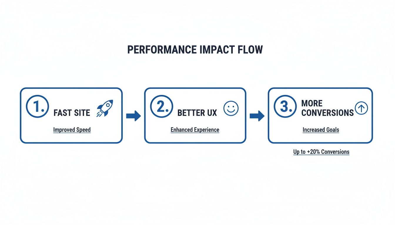
The takeaway here is simple but powerful: a fast, intuitive site is the non-negotiable first step to getting more conversions.
Building a Hypothesis-Driven Testing Plan
Once your analytics have helped you spot a problem area, the next move is to form a hypothesis. This isn't just a random guess; it's an educated, testable statement built on what the data is telling you.
A solid hypothesis follows a simple structure: "If I change [X], then [Y] will happen, because [Z]. "
- Example Hypothesis: "If we change the CTA button copy on our service page from 'Learn More' to 'Get a Free Consultation,' then form submissions will increase, because the new copy is more specific and action-oriented."
With a clear hypothesis, you're ready to design an A/B test. In this test, you show the original version of the page (the "control") to one group of visitors and the new version (the "variation") to another. Then you sit back and let the data tell you which one performs better against your conversion goal.
Globally, the average website conversion rate is a mere 3.68%, but the top-tier sites hit over 11% by following this exact process. I've seen simple A/B tests on landing pages boost conversions by 30%, and personalized CTAs can lift rates by a massive 202%. A strategic post-launch plan is why some brands see 28-38% conversion lifts. You can dig into more of these CRO statistics and their impact to see what's possible.
Key Takeaway: Never, ever make changes based on gut feelings or what you personally like. Every meaningful update to your website should be tested and proven with real user data to confirm it's actually making things better.
Prioritizing Your Tests for Maximum Impact
You'll probably come up with dozens of test ideas, but you can't run them all at once. Prioritization is everything. You have to focus your energy on the pages and elements that have the biggest potential to move the needle on your bottom line.
A simple but effective framework for this is the PIE model:
- Potential: How much improvement can we realistically expect from this test? Tweaking your homepage headline has a much higher potential impact than changing the color of a link in the footer.
- Importance: How valuable is the traffic to this page? A test on your highest-traffic product page is way more important than one on an obscure blog post from five years ago.
- Ease: How difficult will it be to get this test live? A simple copy change is much easier and faster than a complete page redesign.
By scoring your test ideas against these three criteria, you can build a logical roadmap that tackles the highest-impact, lowest-effort opportunities first. This systematic approach ensures your website isn't just changing—it's consistently getting better.
Questions We Hear All the Time About Conversion-Focused Design
When you start talking about building a website that’s laser-focused on growth, a lot of good questions come up. It's a different way of thinking about your digital presence, and understanding the details is key to seeing real, measurable results. Let’s tackle some of the most common ones I hear from business owners and marketing leaders.
What’s the Single Most Important Element?
If I had to boil it all down to one thing, it's clarity. Hands down. When a visitor lands on your site, they need to instantly get what you do, why it matters to them, and what the next step is. Any confusion, even for a second, is a conversion killer.
This isn't just about one part of the page; it has to be everywhere:
- A crystal-clear value proposition: Your headline should do the heavy lifting, immediately telling people why you're the best choice.
- An obvious visual path: Good design isn't just about looking pretty. It’s about guiding the eye from the headline, to the proof, to the call-to-action (CTA).
- One clear CTA: Every important page should have a single, primary goal. Don’t give visitors decision fatigue.
The goal is to make the entire experience feel effortless. Your user shouldn't have to think—the right path forward should feel completely natural.
Do I Need a Full Redesign to Improve Conversions?
Absolutely not. In fact, jumping straight into a massive overhaul isn't always the smartest move. This is where Conversion Rate Optimization (CRO) comes in. It’s all about making targeted, iterative improvements that deliver big results without the cost and time of a full redesign.
We start by digging into your analytics to find the low-hanging fruit. Where are you getting traffic but seeing people bounce? Where in the sales funnel are they dropping off? Once we pinpoint the problem areas, we can run targeted A/B tests on specific elements like headlines, button text, or form layouts.
Key Takeaway: You don’t have to tear down the whole house to fix a leaky faucet. Small, data-backed changes can lead to surprisingly significant gains over time, steadily lifting your site's performance.
This methodical approach ensures that every change you make is a proven improvement, not just a shot in the dark.
How Long Until I See Results?
You'll likely see some quick wins within the first few weeks after launching a strategically redesigned site. These usually come from fixing technical issues—things like boosting page speed or improving the mobile experience—which can slash your bounce rate almost overnight.
But the real, substantial growth, like a 30%–150% jump in revenue, typically builds over the first 90 days. This gives user behavior time to settle and search engines a chance to re-index your improved site structure. The biggest gains, however, come from the ongoing A/B testing and optimization that happens after the launch. That’s where you truly unlock your site’s peak performance.
How Does SEO Fit Into All This?
SEO and conversion-focused design aren't separate strategies; they're two sides of the same coin. Think of it this way: SEO brings the right people to your door, and conversion design convinces them to come inside. You need both to succeed.
What’s great is that many of the things that are good for conversions are also what search engines love to see.
- Fast Load Times: A speedy site keeps users happy (and on the page) and is a well-known ranking factor for Google.
- Mobile-First Design: Since most people search on their phones, a flawless mobile experience is non-negotiable for both users and search crawlers.
- Logical Site Structure: An intuitive layout makes it easy for visitors to find what they need and helps search engines understand and index your content more effectively.
A great digital strategy does both things exceptionally well. It uses SEO to attract a qualified audience and then provides an experience so clear and persuasive that converting feels like the obvious next step. To help with this, many sites are now using tools like AI-powered customer support to answer user questions instantly, which helps smooth out the path to conversion.
At KN Digital, we specialize in building these high-performance digital flagships for luxury and service brands. If you're ready to transform your website into your primary growth engine, let's talk. Learn more about our conversion-focused design services at https://kndigital.co.